Colour & Practice
[ A look into shades of yellow and orange ]
Back in January I posted a short blurb about the colours yellow and orange: it’s influence on MOS, my life, mood, art & design culture. When I was thinking about what to write next (and what might be interesting to read, hello readers 👋🏻), I felt that my short little Instagram caption could be dived into deeper.
It almost feels as if before discovering this little creative nook of flowers and nature, I lived in black and white. I didn’t have a strong appreciation for colour. I remember being stood in one of the many aisles at Mood Fabrics in NYC as a fashion design student, absolutely overwhelmed by the bolts of fabric in every colour imaginable to the human eye. Should this jacket be electric blue? A champagne pink? No – my designs were focused on line, shape and form. Colour came secondary. I happily grabbed the black bolt of fabric and left. I designed in neutrals, I dressed in neutrals. I lived in a city that speaks in colour, and I didn’t take much notice.
I’m trying to remember if there was ever a momentous point where I started to see, understand and experience colour. But there isn’t. It was more of a gradual realisation, where I started to appreciate and notice little snippets. Now so much of how I experience the world is through colour – just as Kassia St. Clair says in her book “The Secret Lives of Colour” (highly recommend picking up a copy.) My memory of my 2019 trip to Japan is clouded over in shades of pink. I remember walking around Chidorigafuchi Park, utterly speechless by the clouds of pink cherry blossoms fluttering down towards the water surrounding the Imperial Palace. Every spring, as those first sights of pink appear after a grey, dull winter, I’m elated. Seeing colour, in a way, is hope.
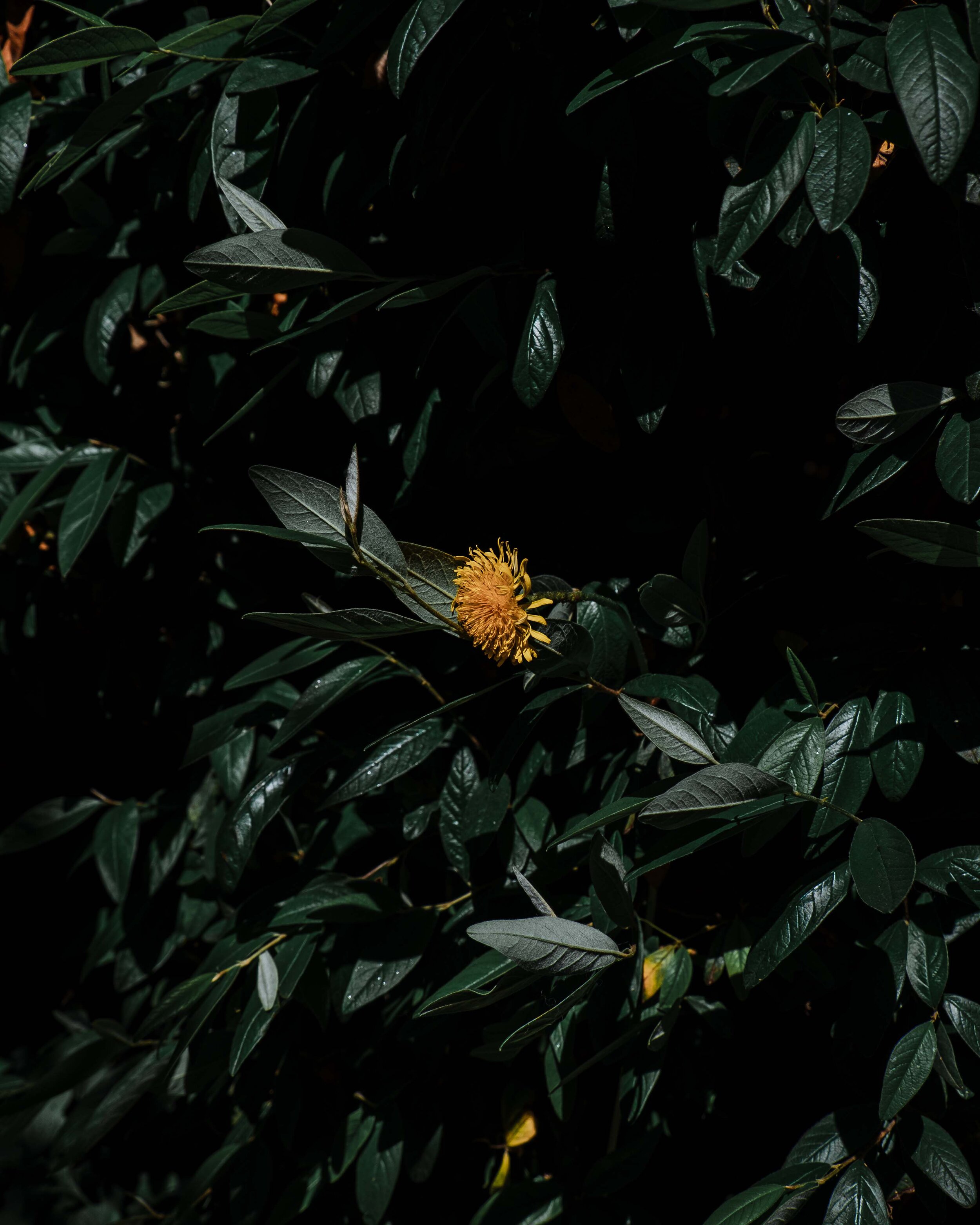
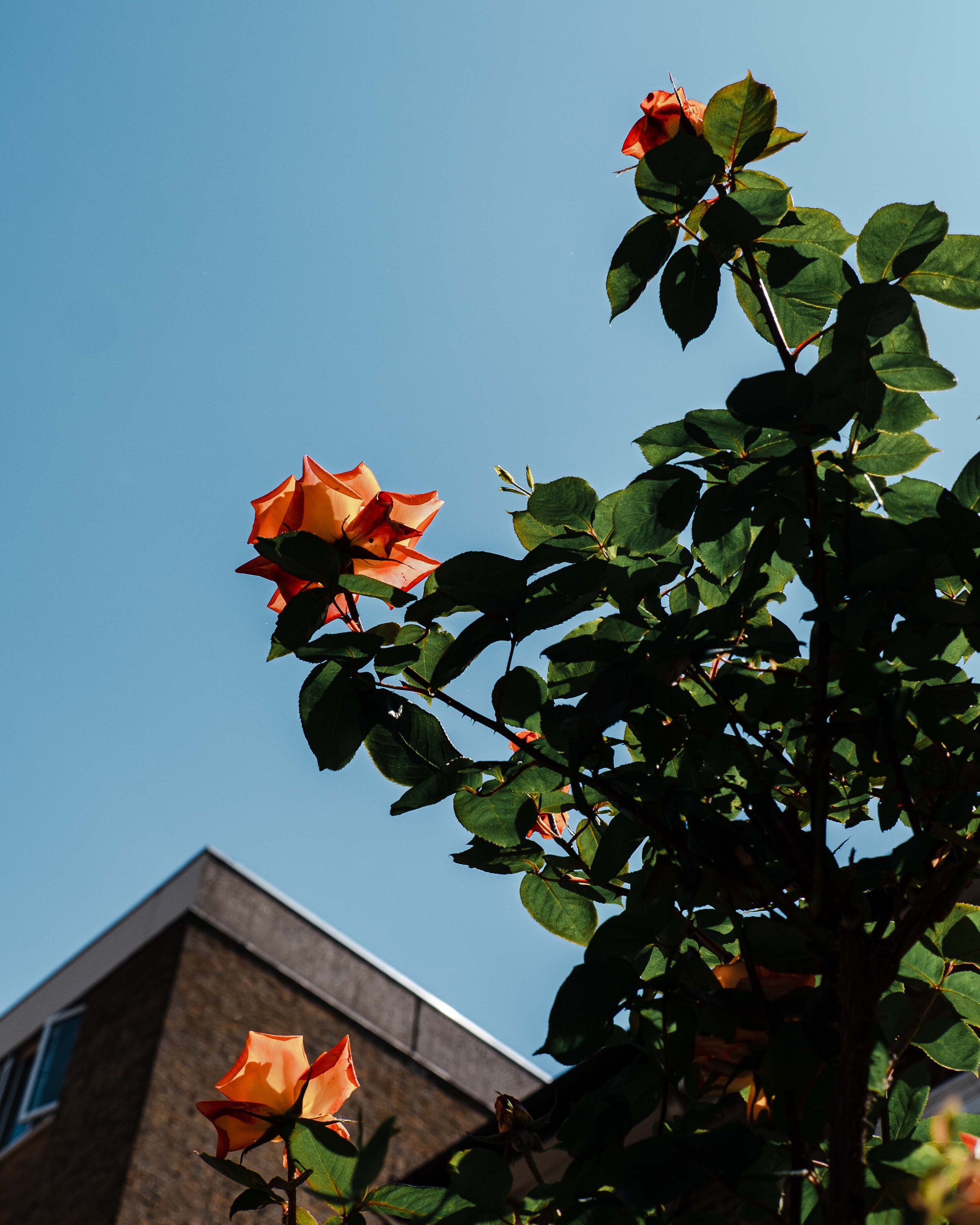
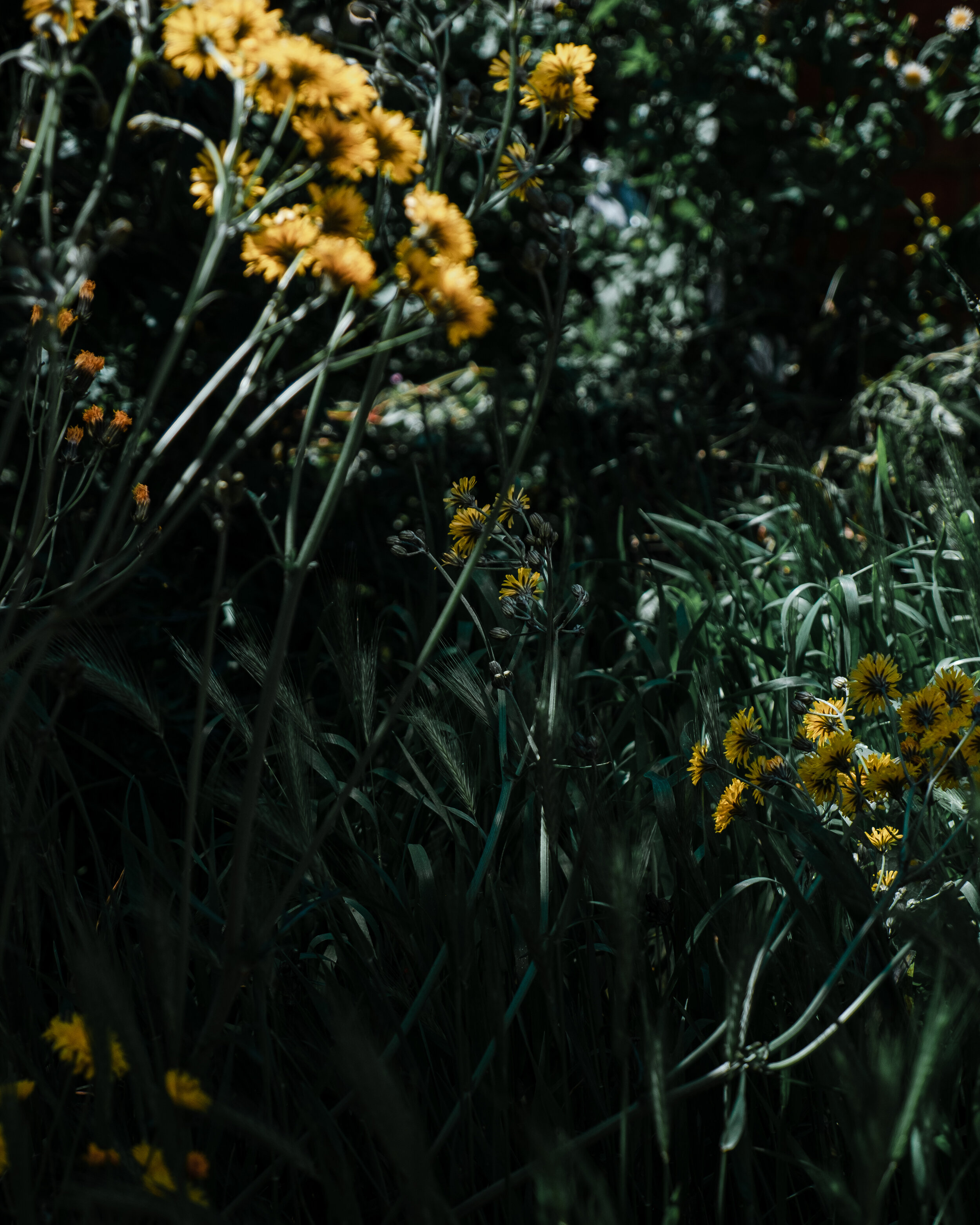
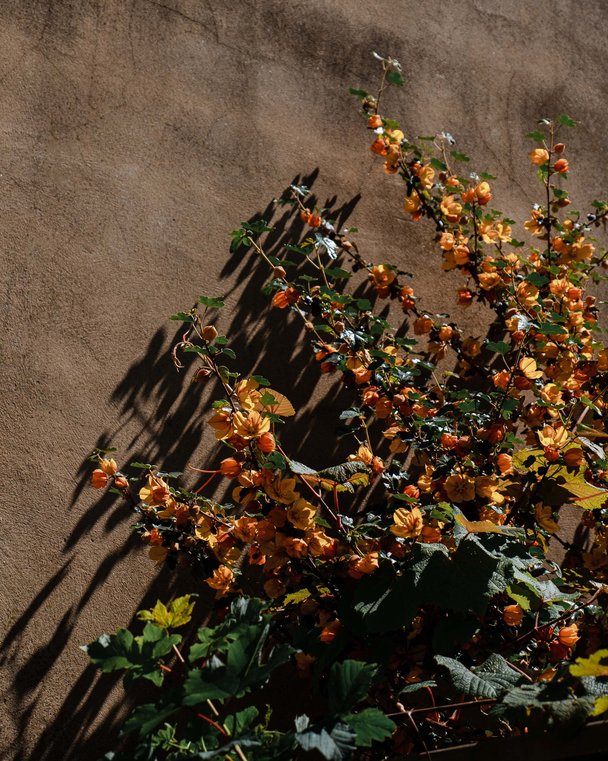
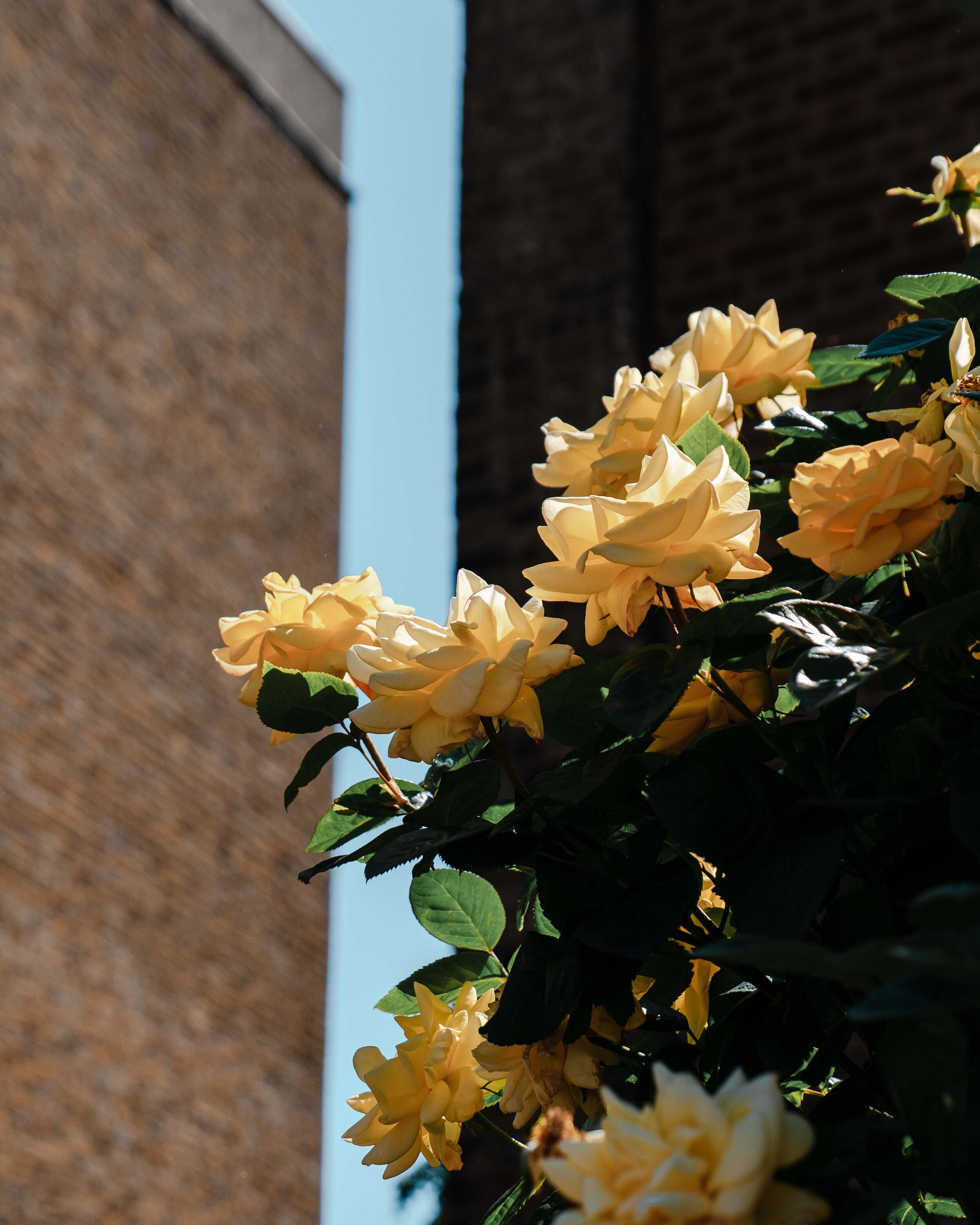
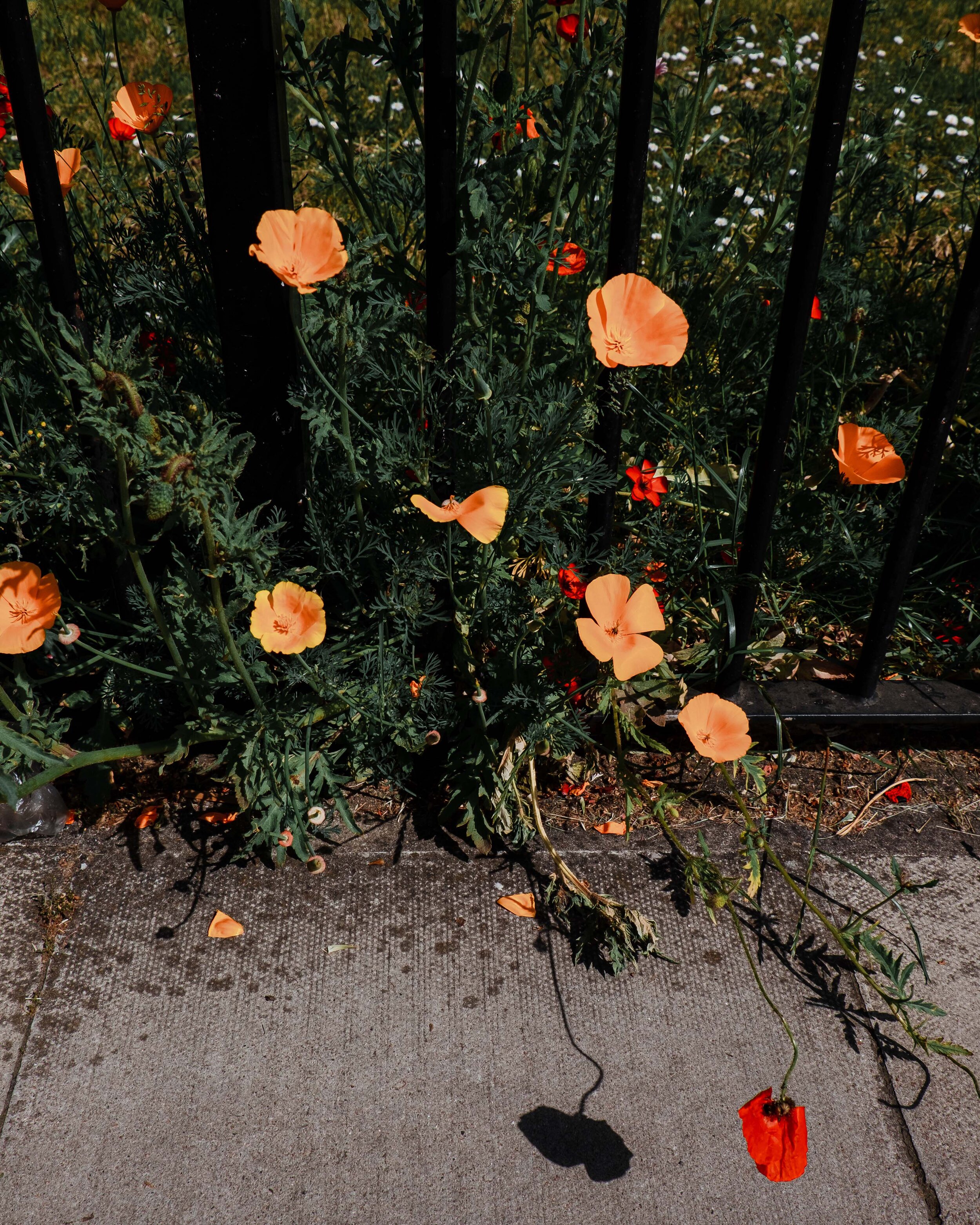
This year was a little different. After feeling the effects of a long winter, coupled with another gruelling lockdown, I was itching to see those first hints of pink around London. To my surprise, those first feelings of elation were grasped by not one, but two colours: yellow and orange. The vibrant yellow narcissus with their saturated orange noses were the very first colours that I came to appreciate. I often overlooked them, cast them aside as I waited to see the first pink hues. They first peaked out in a little wild meadow in front of Hackney City Farm, then inside terracotta planters outside Victorian houses, and finally they graced an entire field on Queensbridge Road. And then there was momentous moment where the pink and yellow/orange mix came together. I was quite literally beaming.
MOS was built on the mix of yellow and orange. When I was initially designing and thinking about the studio, there were no other colours in competition. One of the first materials I worked with when I transitioned into the world of botanical and florals, was mimosa. The fresh buds start off vibrantly yellow and as they quickly dry, they envelop into a warming yellow, orange hue. It all seemed perfectly fitting to choose these colours for the MOS logo. They always seem to bring me back to my happiest memories. Yellow and orange remind me of the smiley face icon of rave culture, going to see Van Gogh’s sunflowers at the Tate Britain, the trays of gigantic Amalfi lemons sold on the road on the Italian coast and walking along the Seine surrounded by whimsical mimosa trees during the week of my graduation. Whenever I go to New Covent Garden Market, there is always a wrap of yellow in my bag. It satisfies a craving. It encapsulates over me as a feeling of happiness and gratitude. I often wonder if another colour will ever come to replace my orange and yellow infatuation. Time will tell.
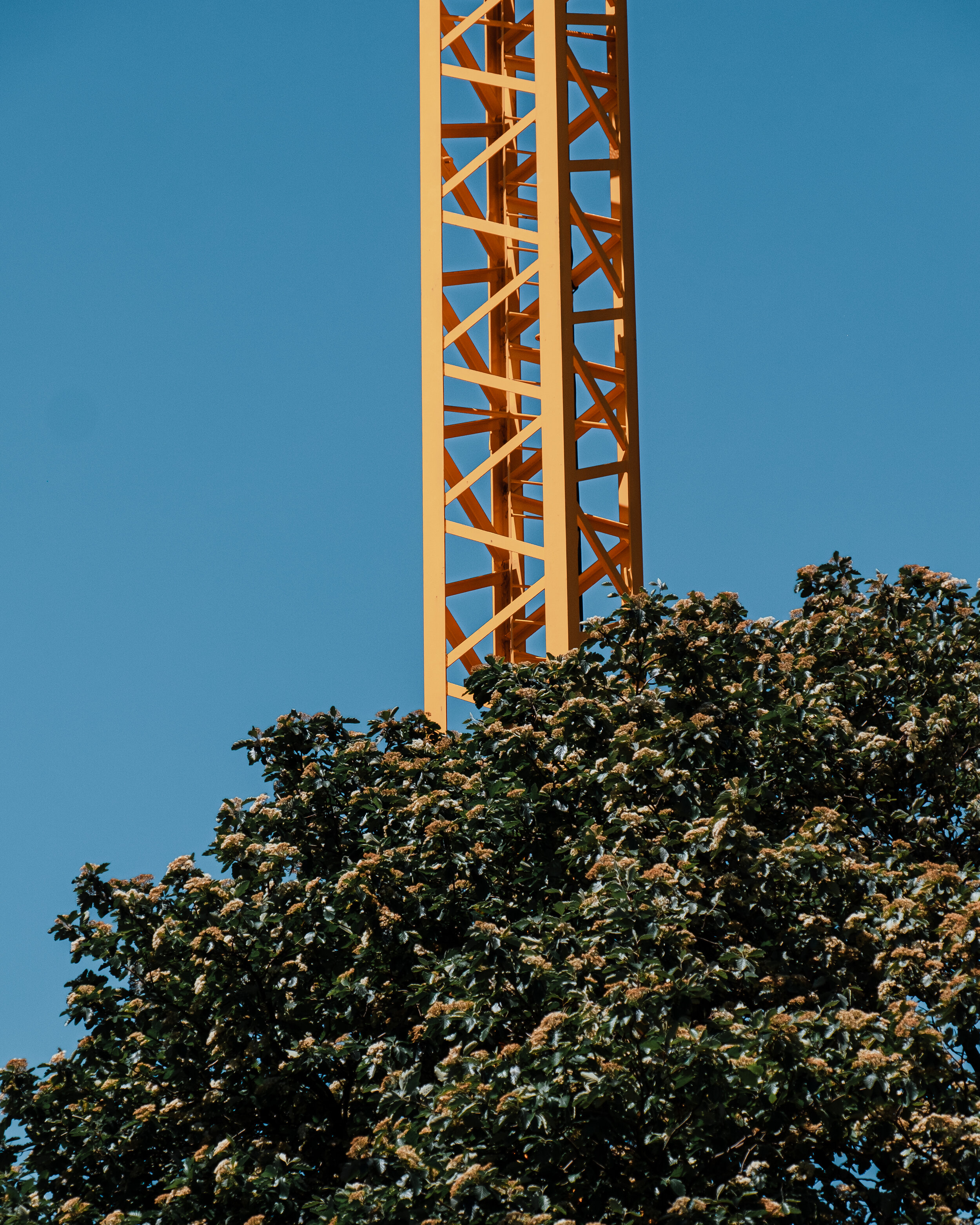
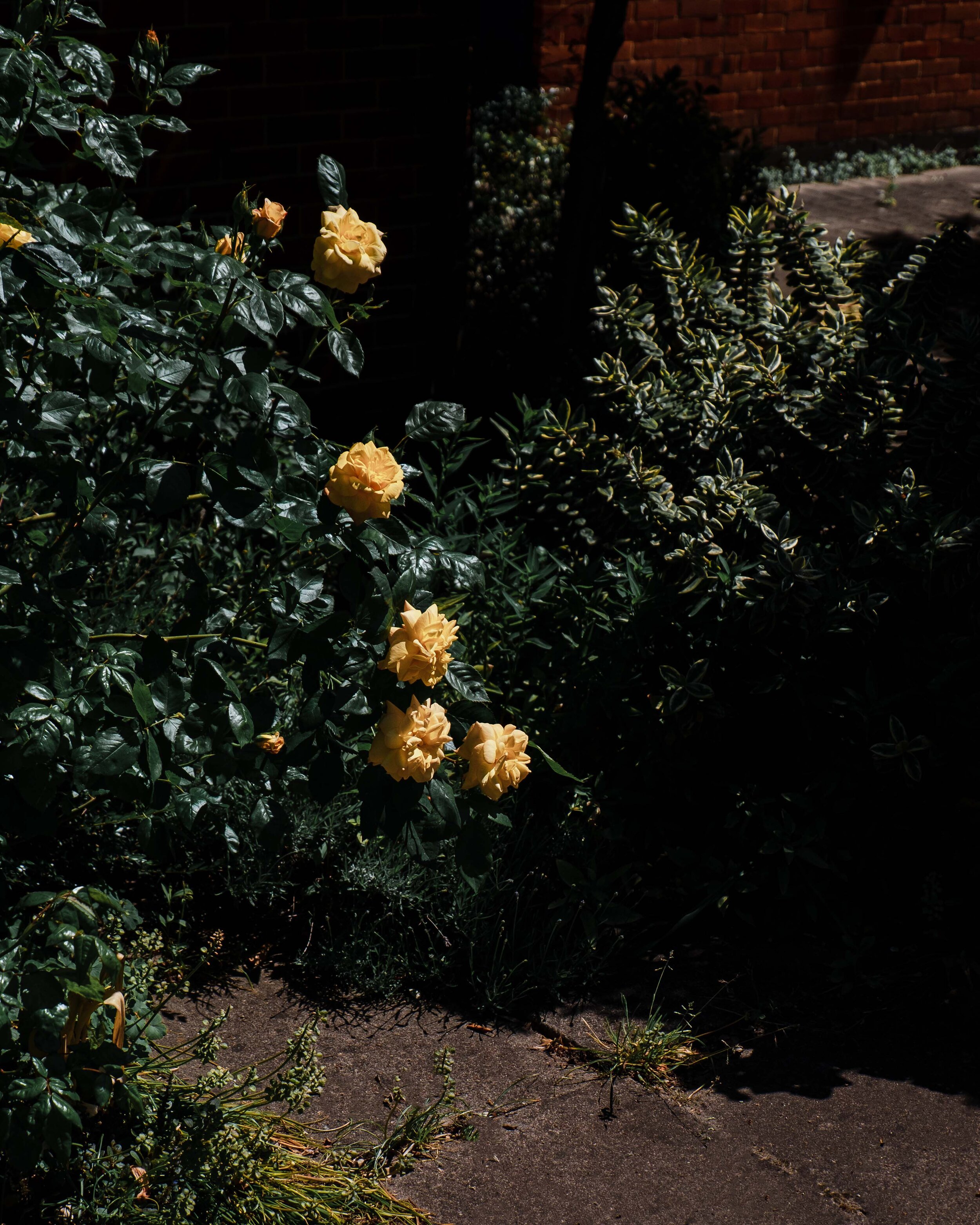
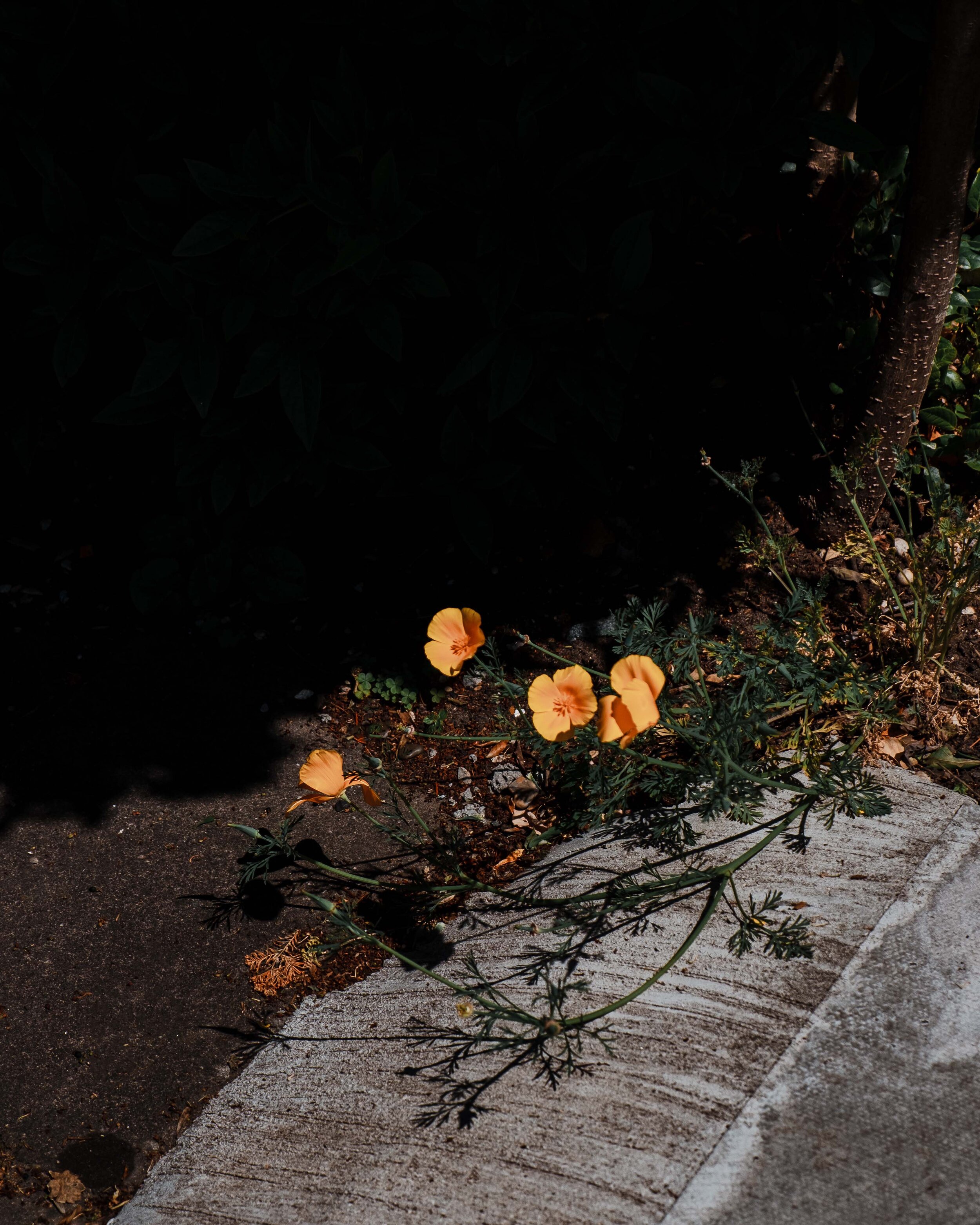
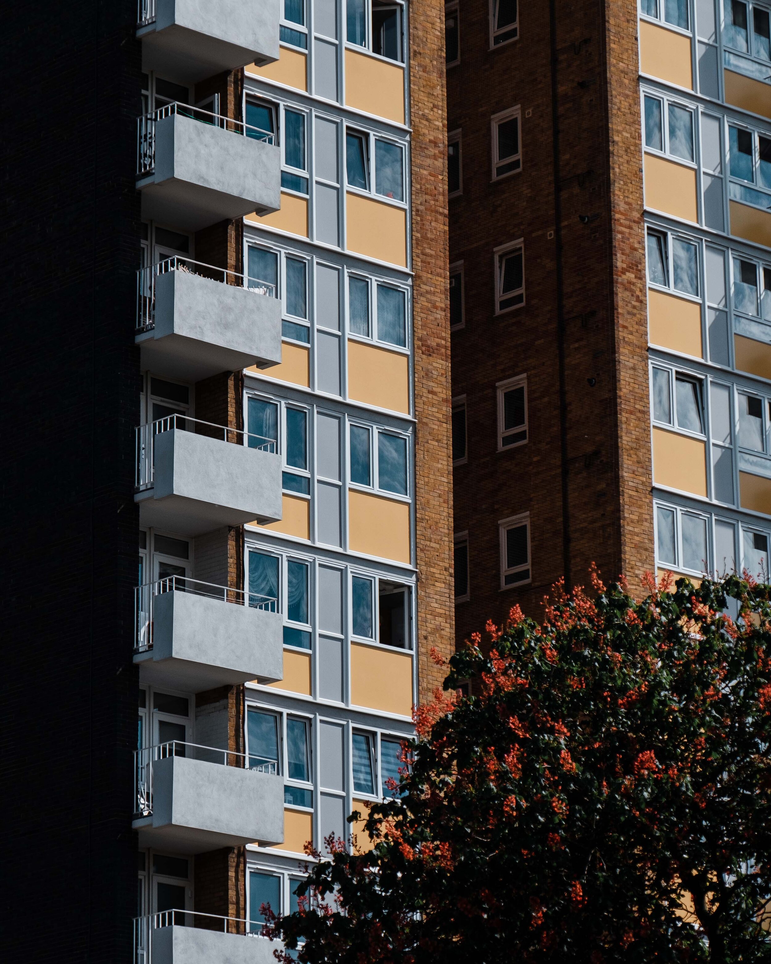
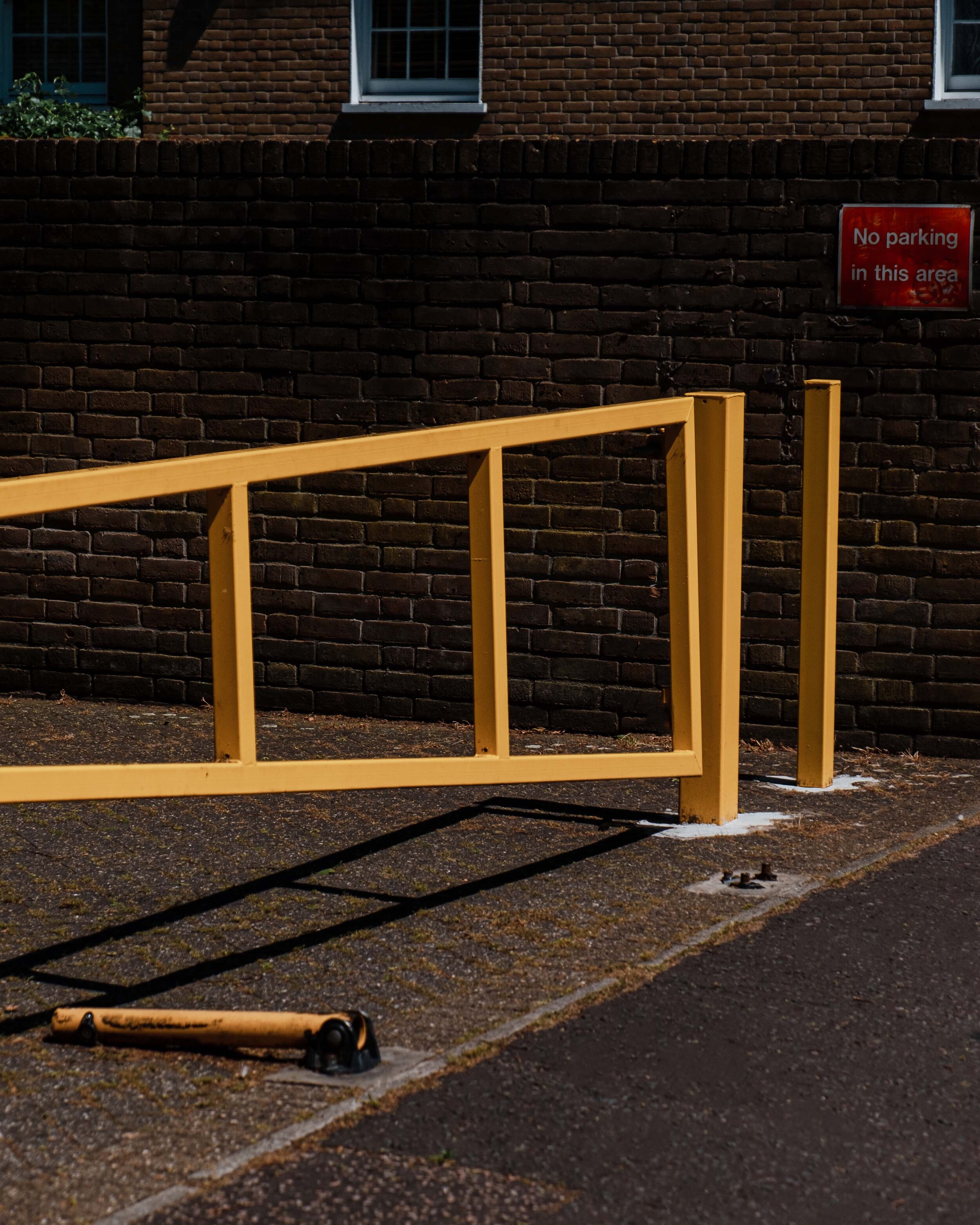
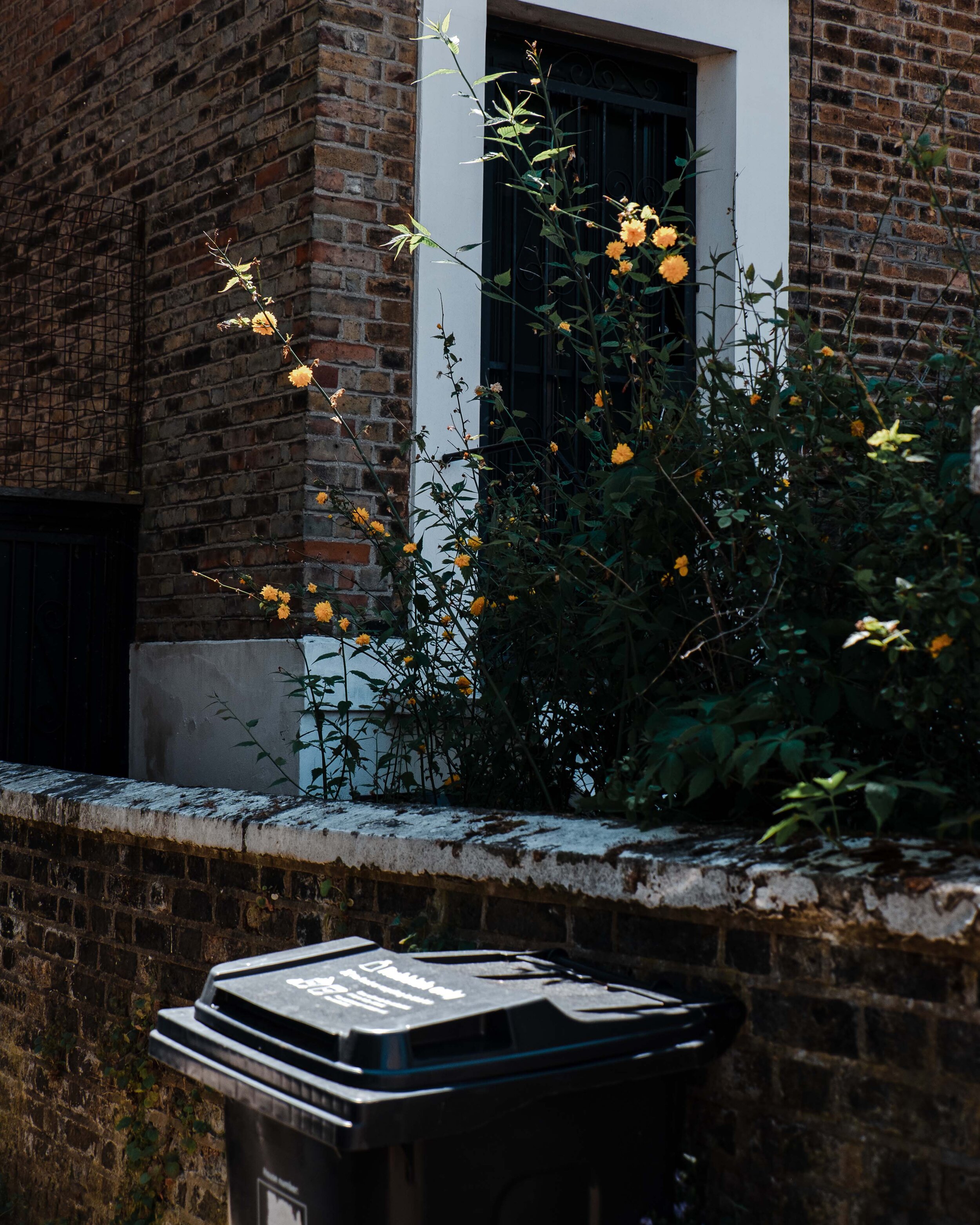
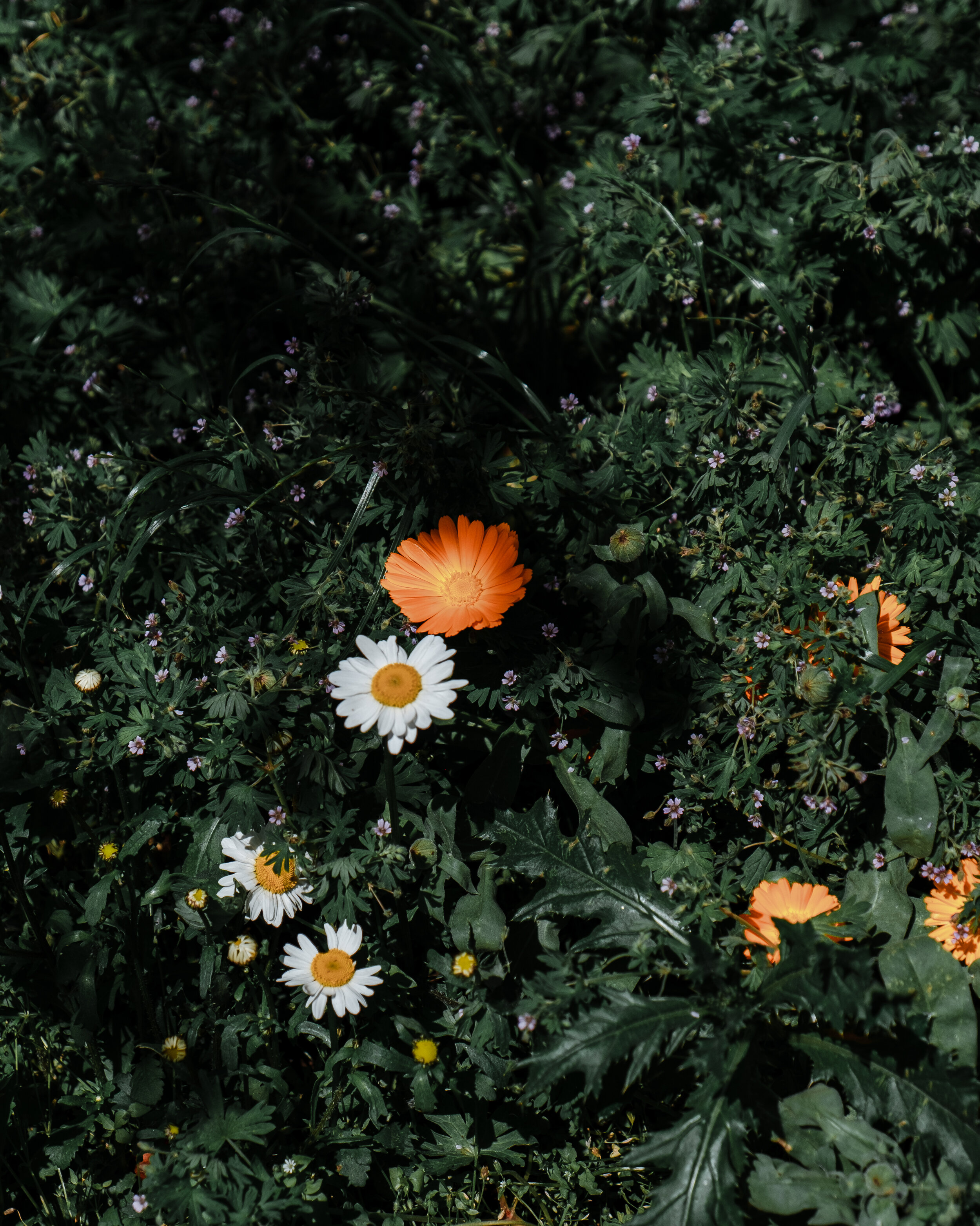
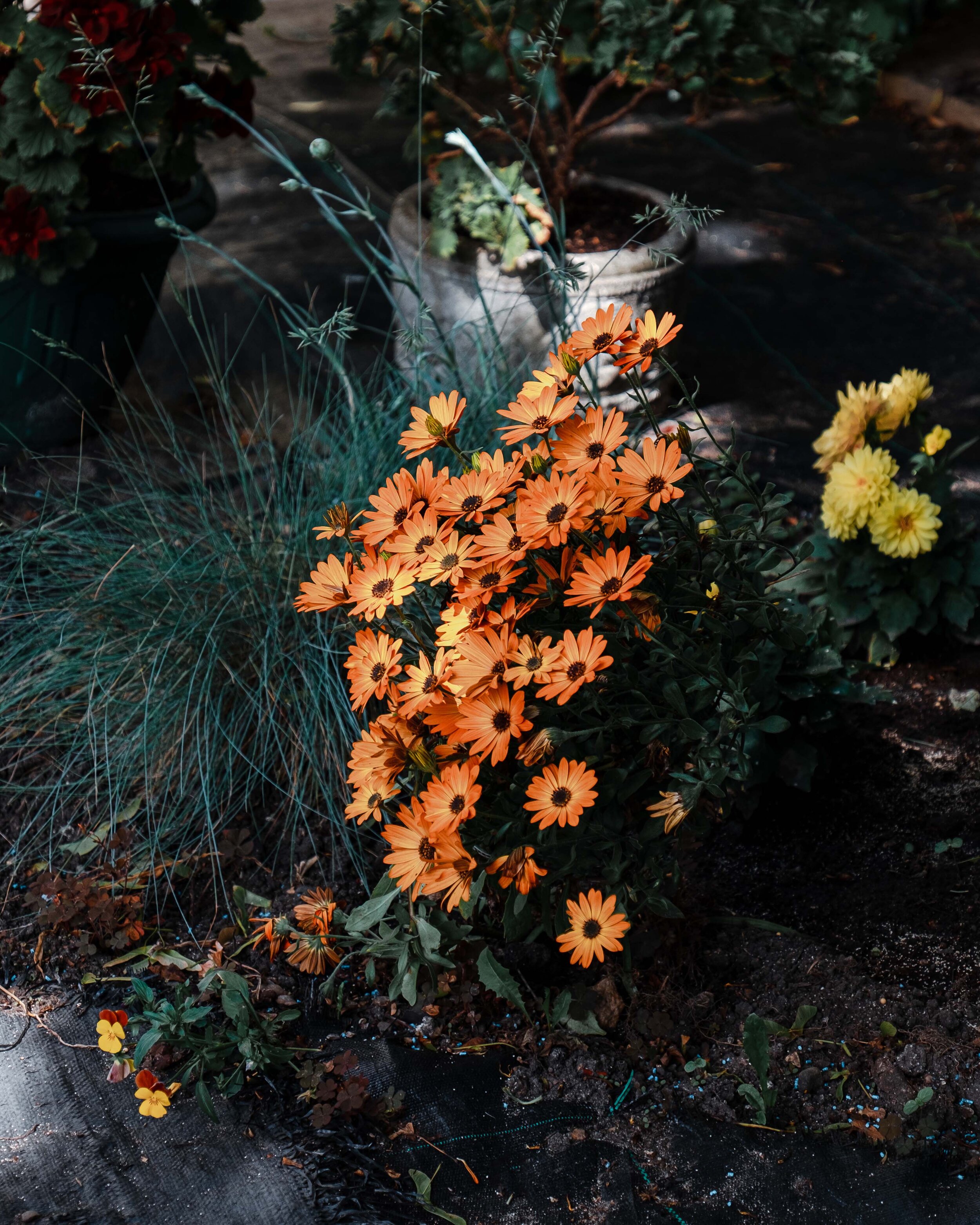
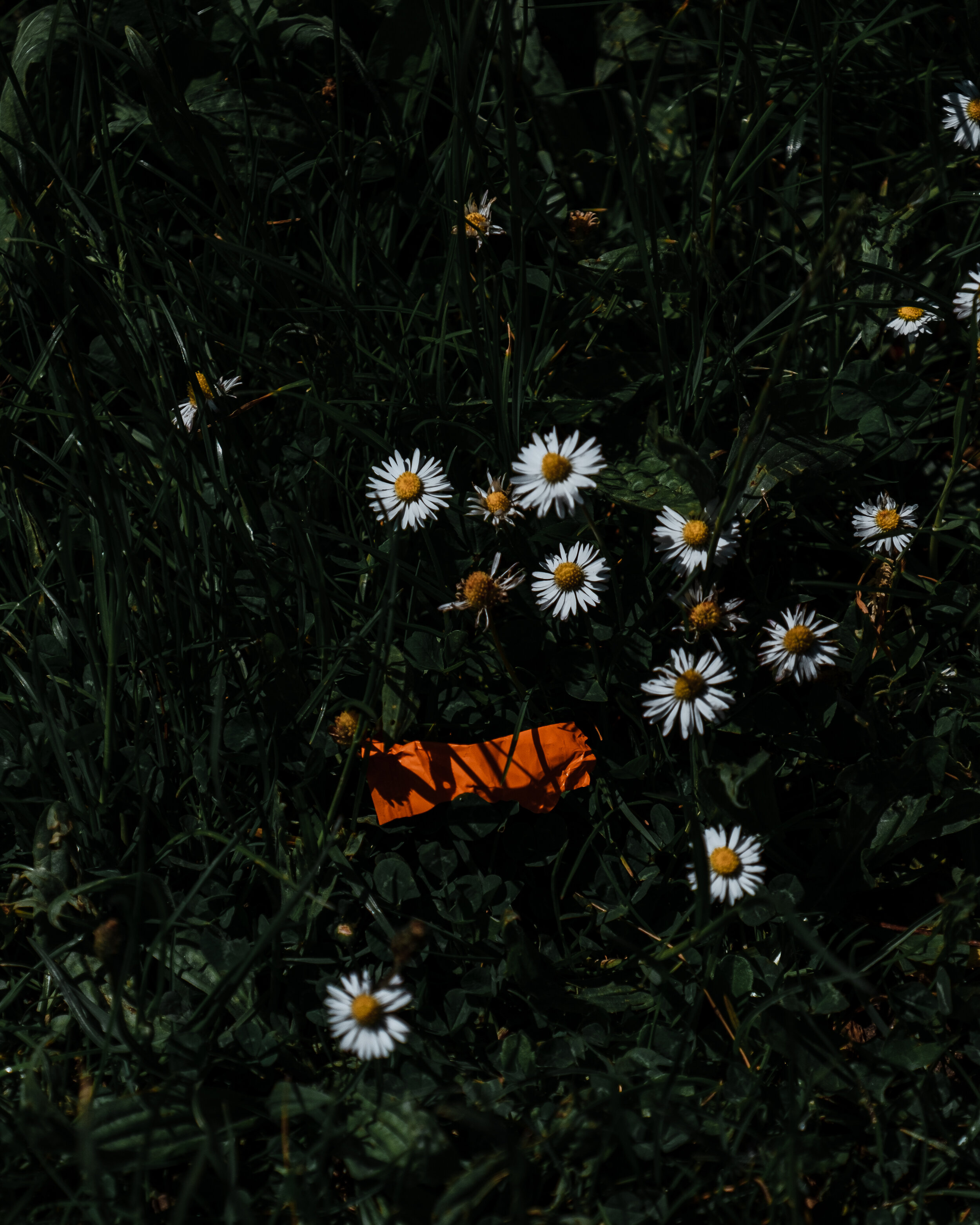
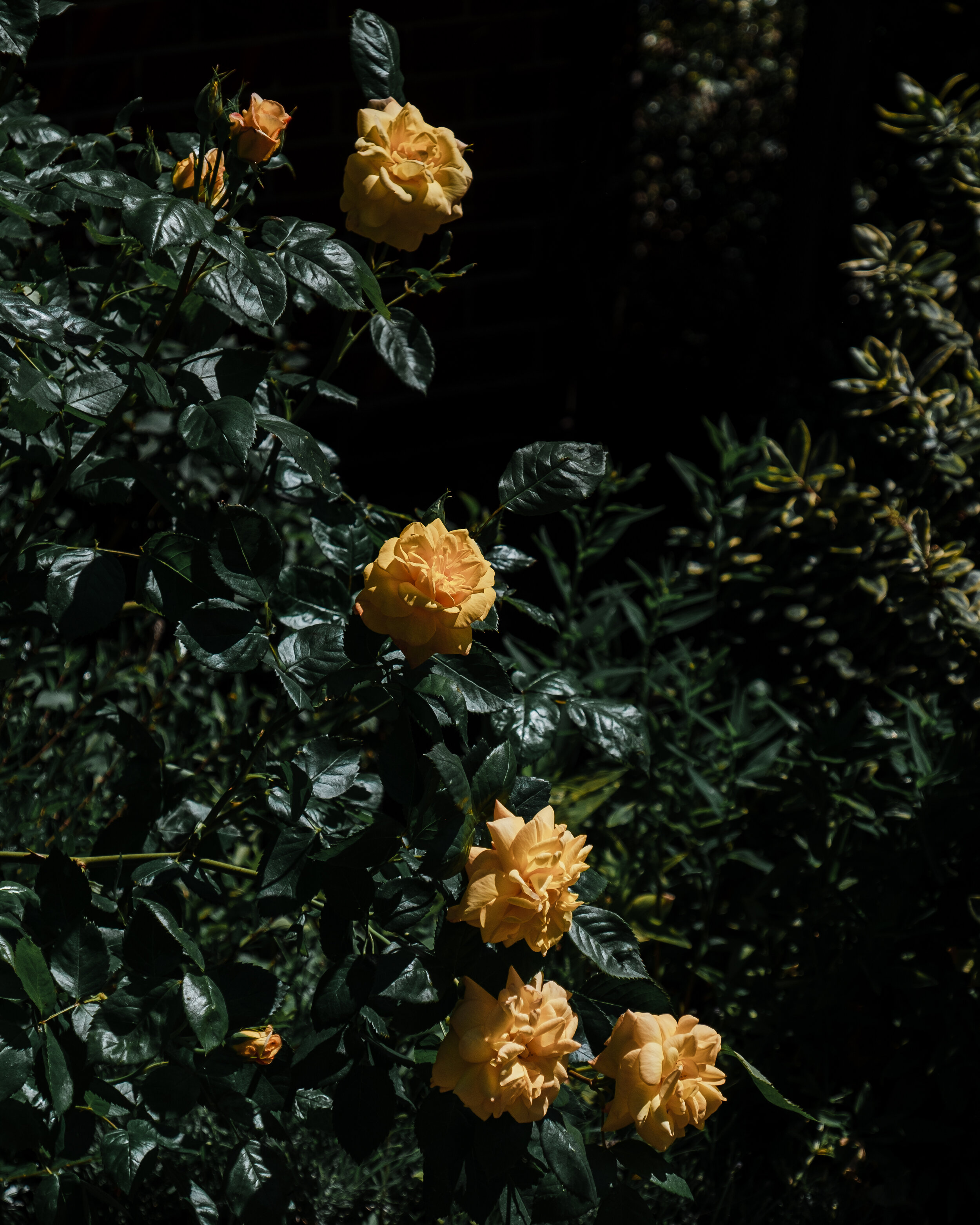
As a little homage to these two colours, I took a few days to wander around East London and photograph all the yellow and orange combinations I could spot. It wasn’t exclusive to nature. I photographed everything that fit the brief. It wasn’t a surprise that there was an abundance of subject matter.
Hope you enjoyed this little bright, coloured snippet into my life. Perhaps next month, I’ll tackle my least favourite colour!